ButcherBox
Designing the subscription experience behind a growing e-commerce business
When I joined, ButcherBox had strong product-market fit but a digital experience that wasn't keeping up. The signup flow was built for desktop and falling apart on mobile, too many decisions at once, no sense of how long it would take, and no clear picture of what you were committing to. Existing members were struggling to manage their subscriptions, what was in their next box, when it was shipping, when it would arrive, the experience wasn't supporting their basic needs.
Over four years I led the full redesign of ButcherBox's digital experience, directing a small team of designers while doing the core design work myself. I overhauled the signup flow into a clear mobile-first experience, redesigned the member shopping and subscription management experience from the ground up, and established a mobile-first design system the team could build on. The result was a more coherent product across acquisition and retention, one that was able to grow with the business.
Feb 2019 – May 2023
Led UX & product design
Mobile conversion
Subscription onboarding
AOV
Member shopping
CX inbound
Box management
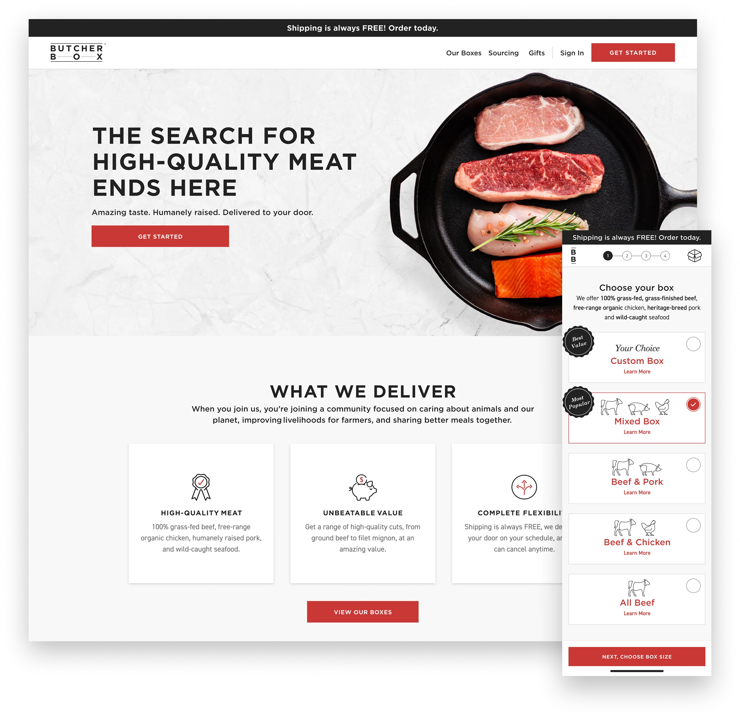
The homepage leads with the value propositions and strips the navigation back, so the first decision a visitor makes is whether to start a box rather than where to click.
A clear picture before a single pixel moved
Before any design work started, I ran a UX assessment with a UX researcher that included a UX audit, unmoderated usability testing, and interviews with current members. The assessment allowed us to understand where and why the experience was breaking down.
Three findings shaped everything that followed.
- The signup flow asked for too many decisions at once, with no sense of how long it would take or what customers were committing to.
- ButcherBox's quality and flexibility weren't communicated until too late in the funnel.
- Members managing their subscriptions faced a fragmented interface that generated confusion and drove unnecessary calls to customer service.
Those findings aligned the team on two priorities: communicate ButcherBox's value early and often, and design a consistent, mobile-first experience that anticipates what members need next.
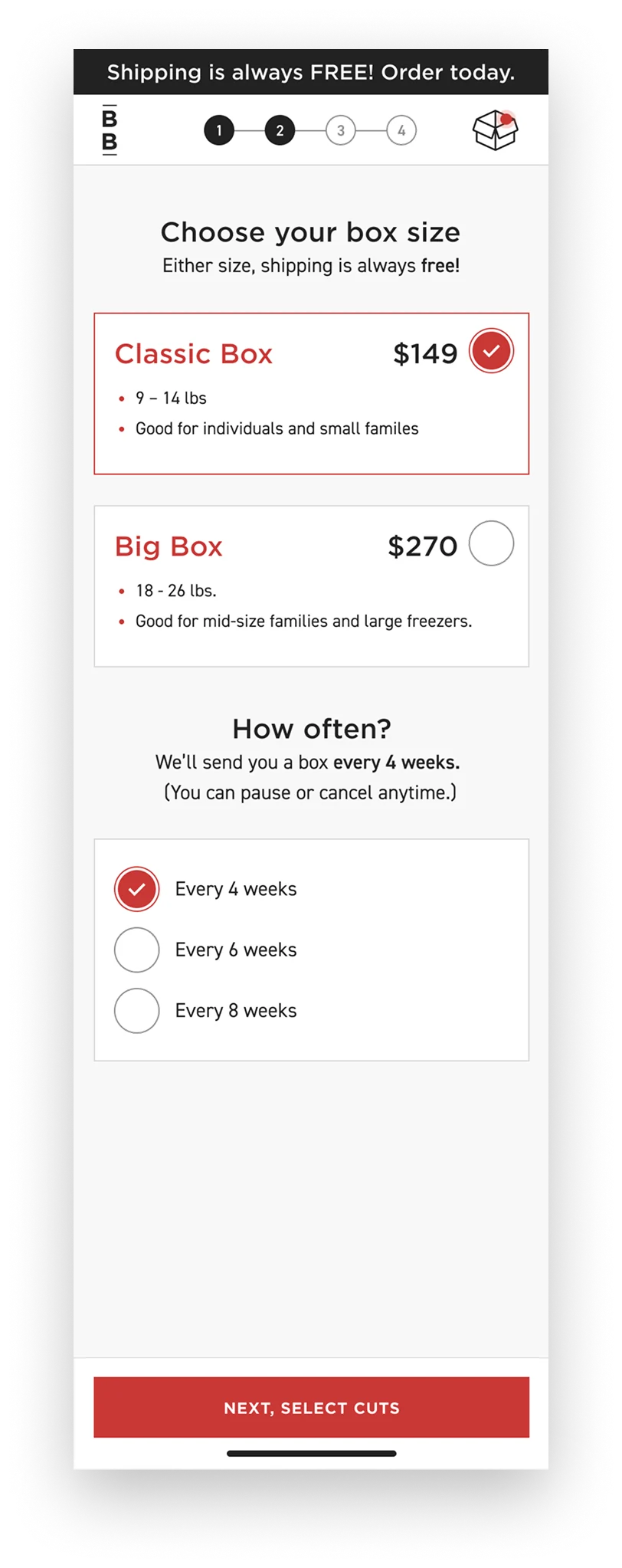
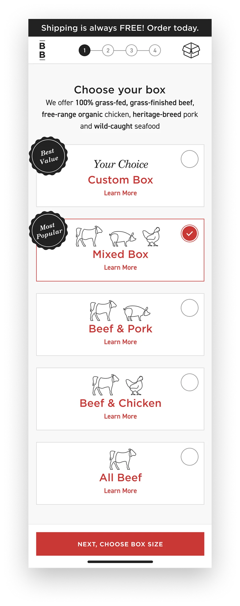
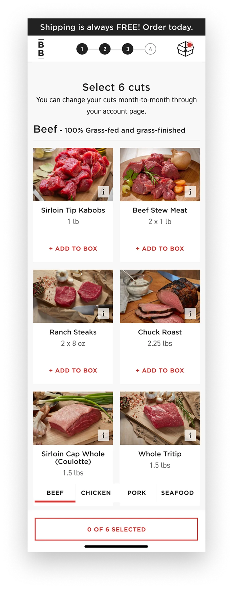
Step one asks for one thing: how much meat, for how many people. The progress indicator and the running box summary are present from the first screen so nobody starts without knowing how long this takes.
A sign up flow that communicates value & has a finish line
The old flow had no progress indicator, no persistent summary of selections, and no clear end in sight.
I redesigned it as a four-step flow built for thumbs, generous tap targets, a progress indicator at the top of each screen, and a persistent "Your Box" panel so customers could see and adjust their selections at any point without feeling locked in. ButcherBox's value messaging was woven into each step rather than front-loaded and forgotten.
We validated the redesign with usability testing before launch and iterated on two friction points identified in those sessions.
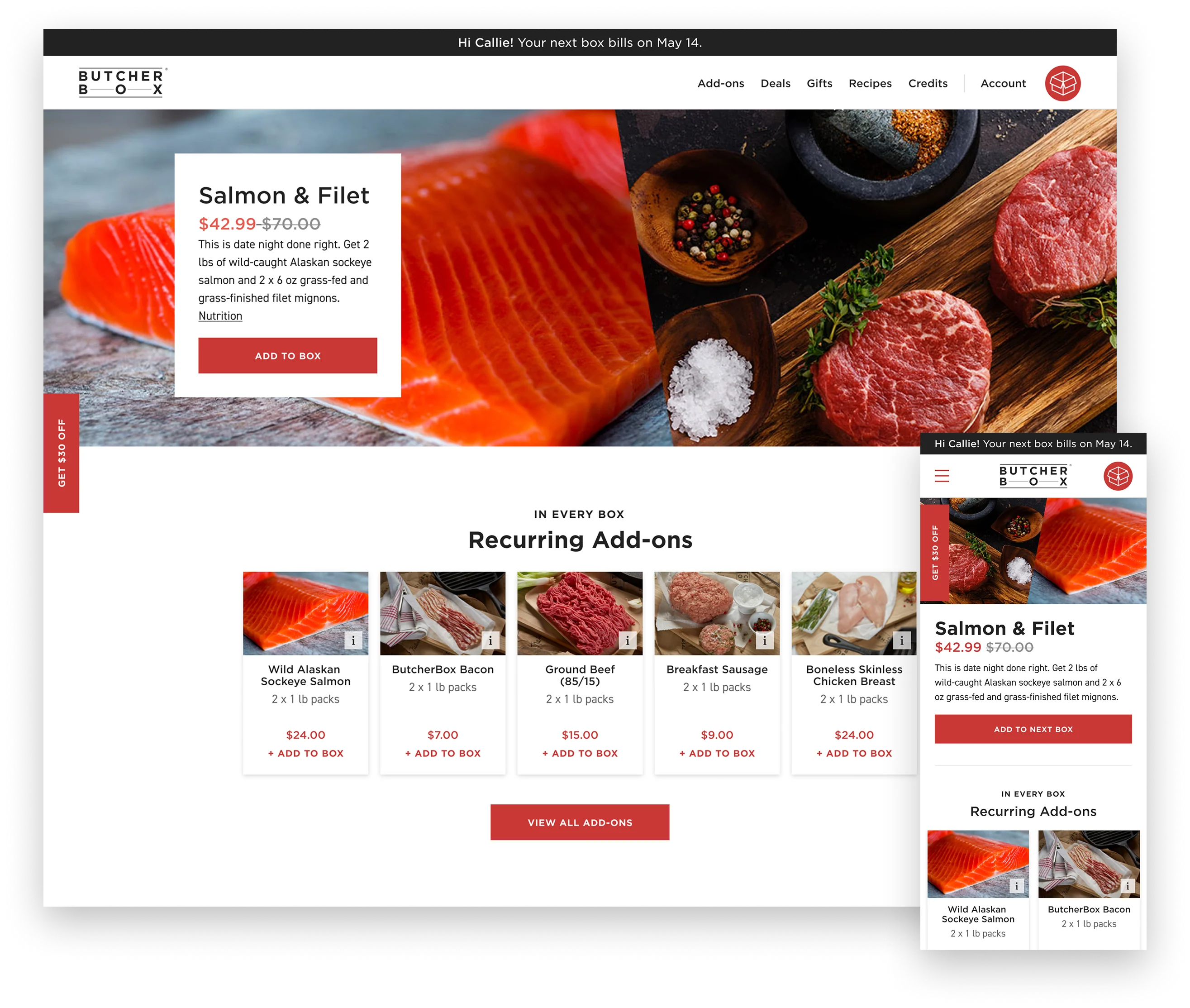
The member homepage follows a familiar e-commerce structure: deals and add-ons surfaced instead of buried, the next box always visible and editable like a cart, and recipes browsable and saveable in the same place.
A member experience worth coming back to
After signup, members landed in an experience that made it difficult to do anything. Box management was buried and add-ons and deals were hard to find. I redesigned the member homepage and navigation around a more familiar e-commerce IA. Deals and add-ons are surfaced prominently, your next box is always visible and editable like a cart, and a new section for browsing and saving recipes.
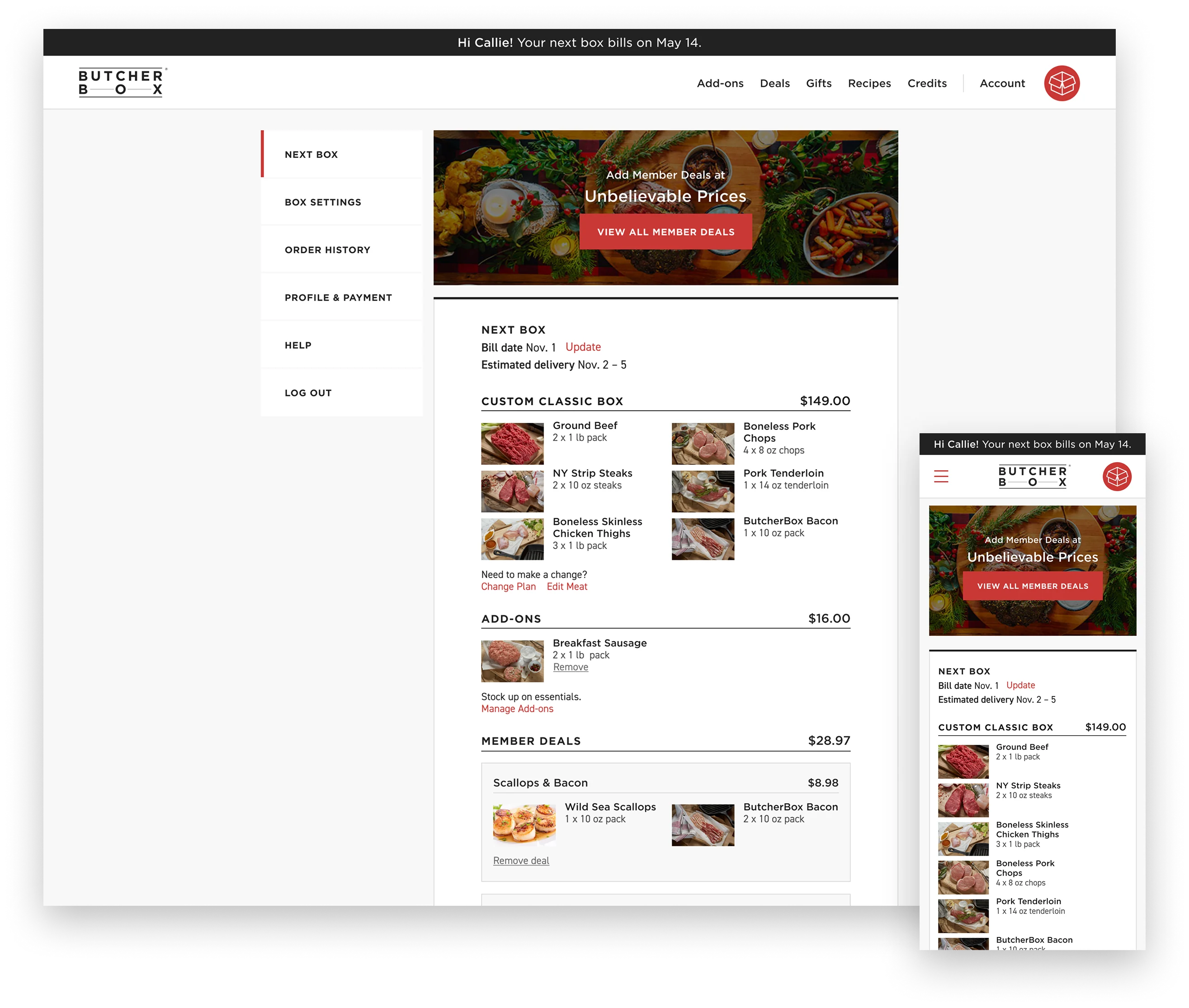
The next box is the center of the view. Bill date and estimated delivery sit up top, delivery was missing entirely before, and members need it to plan for a box that goes straight to the freezer, with totals broken out by subscription, deals, and add-ons, each product editable.
The subscription management view was redesigned around the member's next box. Bill date and estimated delivery date are prominent, estimated delivery was missing entirely from the old experience, and it matters: members need to know when their box is arriving so the contents go straight to the freezer. Price totals are broken out transparently by category, subscription box, deals, and add-ons, with thumbnail photos and clear edit controls for every product. The goal throughout was to make sure members never felt locked into a plan they couldn't adjust.
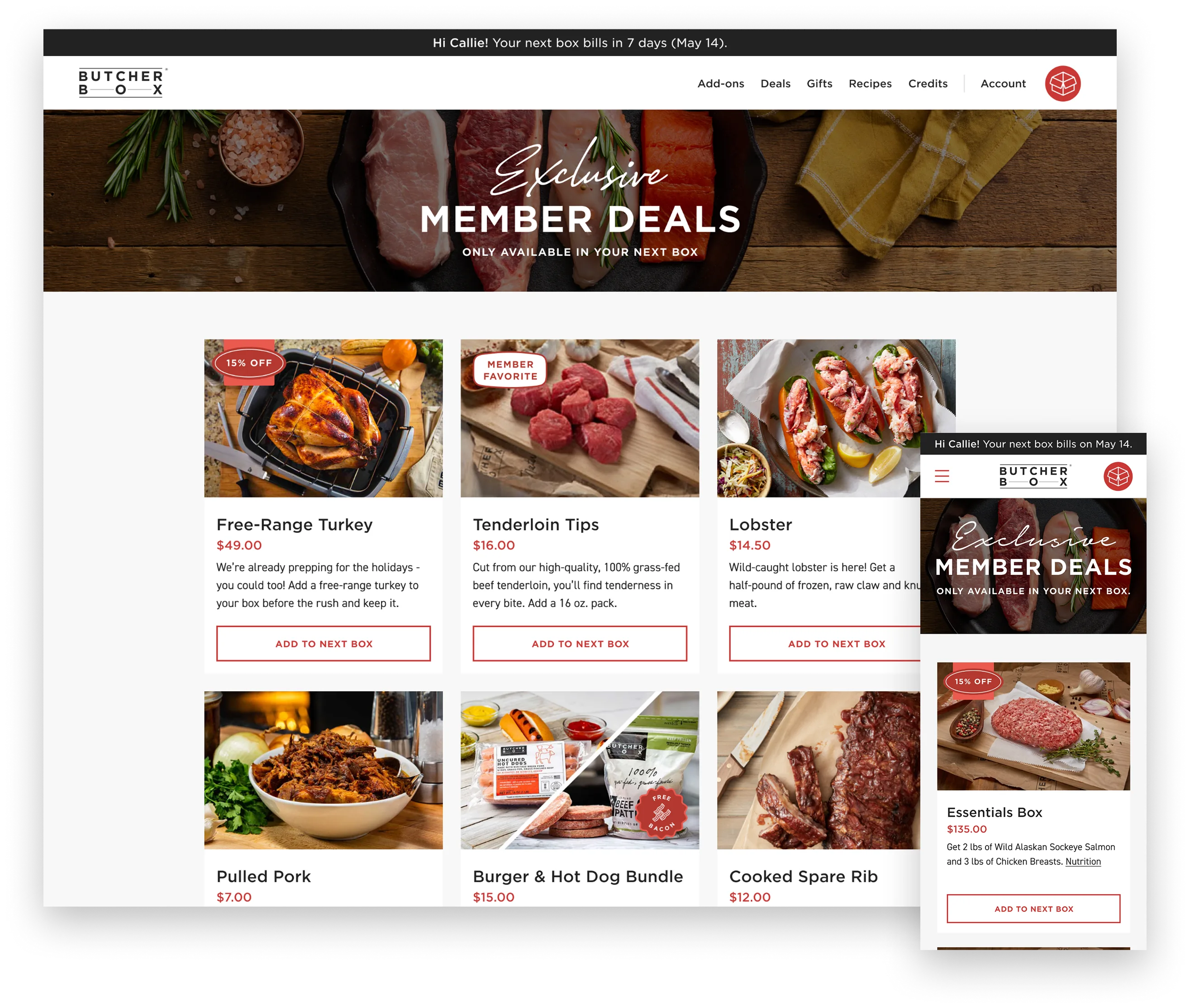
Pulling deals onto their own page separates them from everyday shopping and makes the window explicit: the offer is tied to the next box, so acting on it means editing the box you already have open.
The results
Over four years the signup flow went from a desktop form that fell apart on mobile to a four-step, thumb-first experience with a visible finish line, and the member experience was rebuilt around the next box: what's in it, when it bills, when it lands. Mobile conversion and average order value both rose, and questions that used to become support calls got answered in the product. I led design across acquisition and retention and left a mobile-first design system behind.