Blue Apron
Sharing what you cooked & managing the subscription
Most of the design work on Blue Apron's first iOS app went into a camera. People were already posting photos of what they cooked on Instagram, so we designed the app around that: pick the recipe you made, then personalize the shot with custom stickers, animated steam, and filters before sharing.
The rest of the app handles the subscription. This week's recipes, next week's menu, skip a delivery in one tap. Rate the recipes you love and save a digital version of the recipe card to cook again in the future.
Dec 2014 – Oct 2015
Engagement
Zero to one
Designed end to end
Top 25
Apple's best apps of 2015
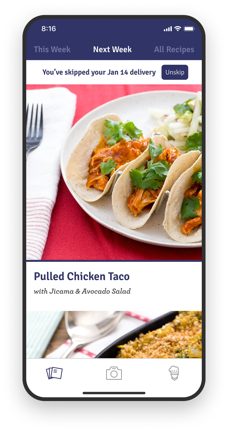
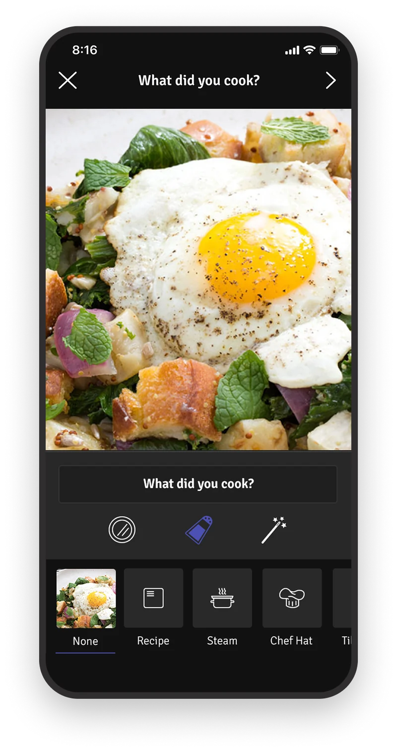
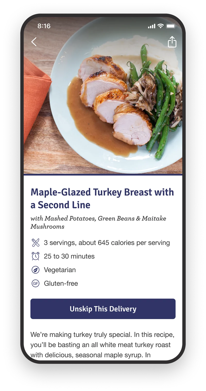
The two halves of the app: managing what's coming, and sharing what you cooked.
Designing a custom photo experience using the native iOS camera
Food shot on a phone in a kitchen looks bad. Overhead light, no styling, a plate that's already half eaten. The photo tools had to work for that, not for a studio.
So the photo tools were specific rather than generic. Four filters, each tuned to flatter food under kitchen lighting, and each named after one of Blue Apron's offices. Overlays that carried the recipe name, or the recipe name with a Blue Apron mark, plus tilt shift to drop the background and a chef's hat for people who wanted one.
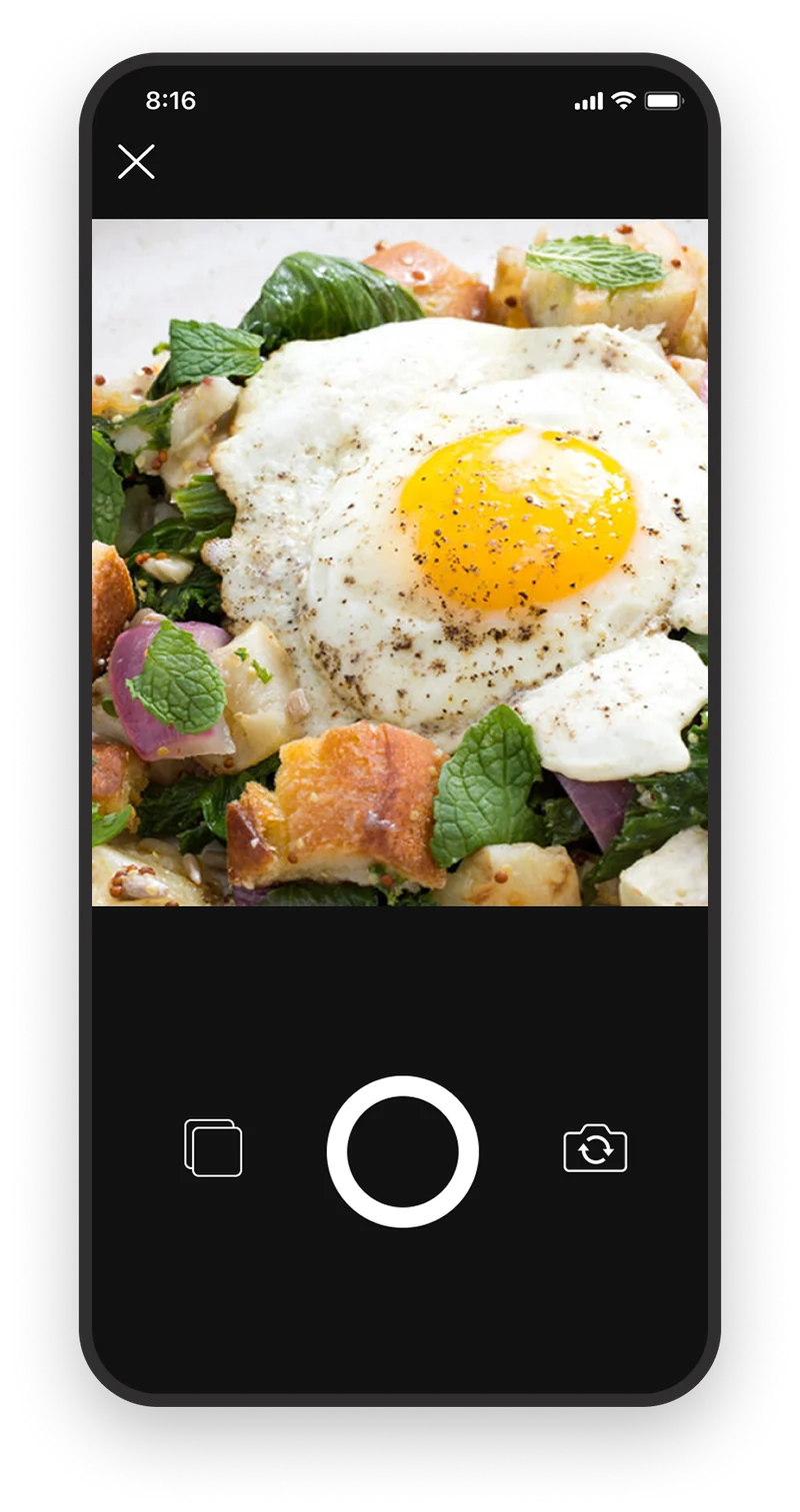
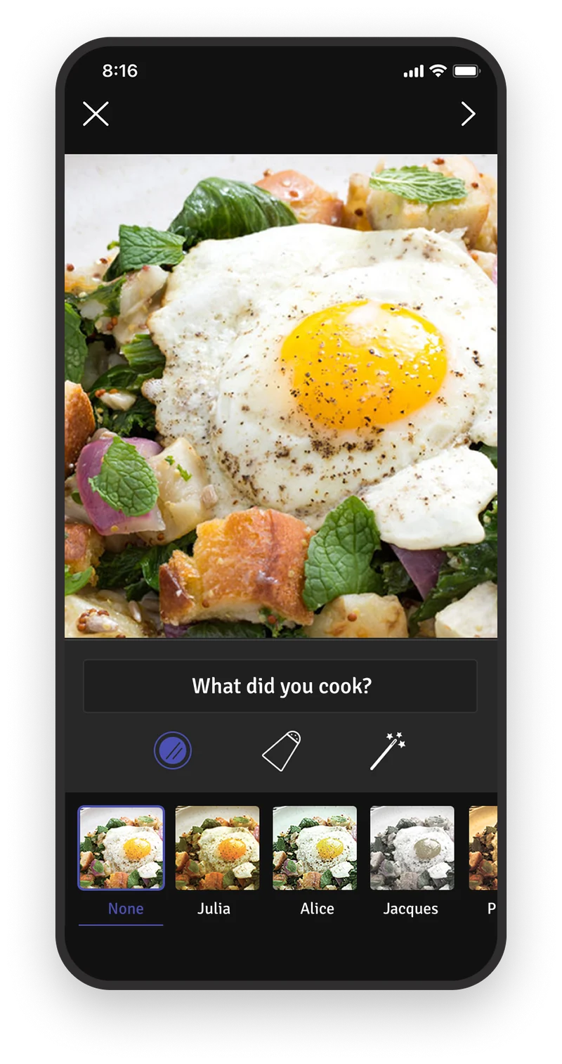
The camera opens inside the app. Filters and overlays are tuned for food shot on a phone in a kitchen.
Steam was the one that took the most work. You place it on the plate and size, move, and rotate it, and the photo exports as a four-second video. This was 2015, before short video was ambient on any of the platforms people were sharing to. A still photo of a finished meal became something that looked hot.
The Recipe overlay sets the dish name in the same type treatment as the printed recipe card, so a photo of the finished meal carried the card's branding without anyone having to add a logo.
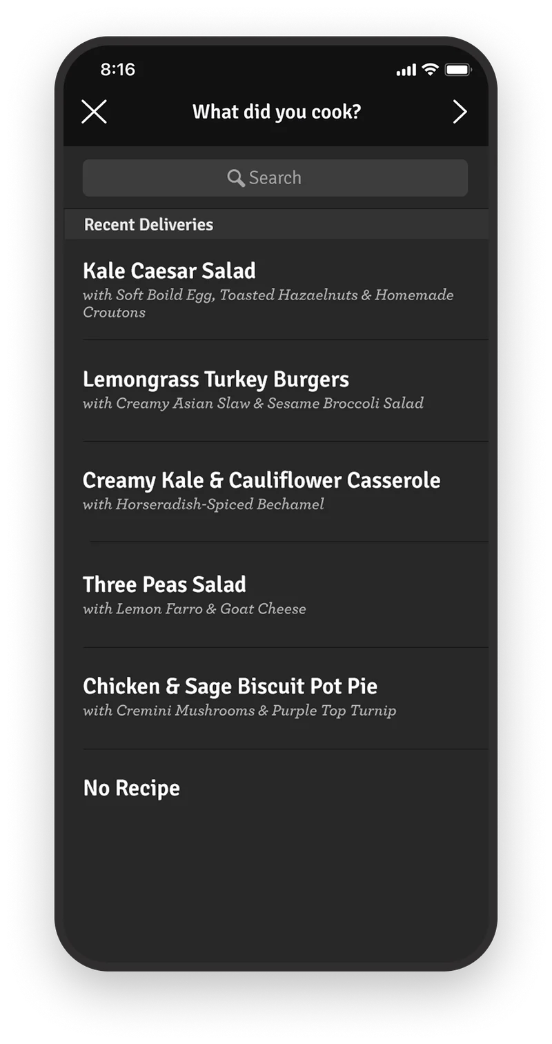
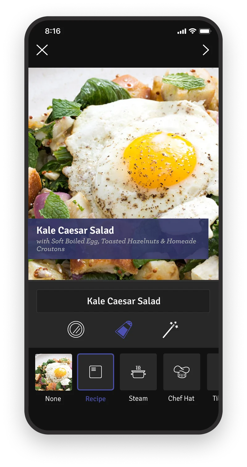
Tap the recipe name to tag the photo. The picker lists recent deliveries rather than all 800 recipes, with an option for anything that didn't come in a box.
Making it easy to skip a week
A meal kit fails on the weeks you can't cook. Travel, leftovers, a night out. The subscription runs whether or not your week cooperates.
The menu is organized as This Week, Next Week, and All Recipes, so the decision in front of you is always the next box. Skipping is one tap from that view, and unskipping is the same tap. A skipped week stays visible with the recipes still browsable, because the point of showing them is that you might change your mind.
Making the skip easy is a retention decision. The alternative to a skipped box is rarely a delivered one. It's a cancellation.
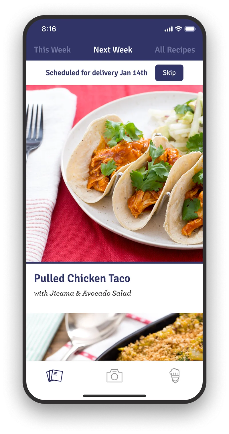
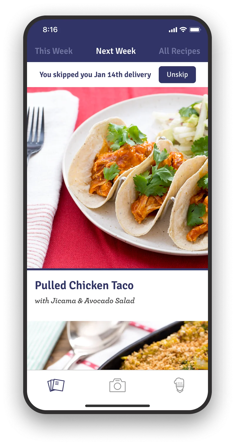
Skipping an upcoming delivery is simple. One tap to skip, one tap to unskip.
The app shipped in October 2015 and the work continued from there. Native subscription sign-up, a mobile web delivery schedule, and a rebuilt registration flow for the web. Once the app proved people would manage a subscription on a phone, the sign-up had to work there too.