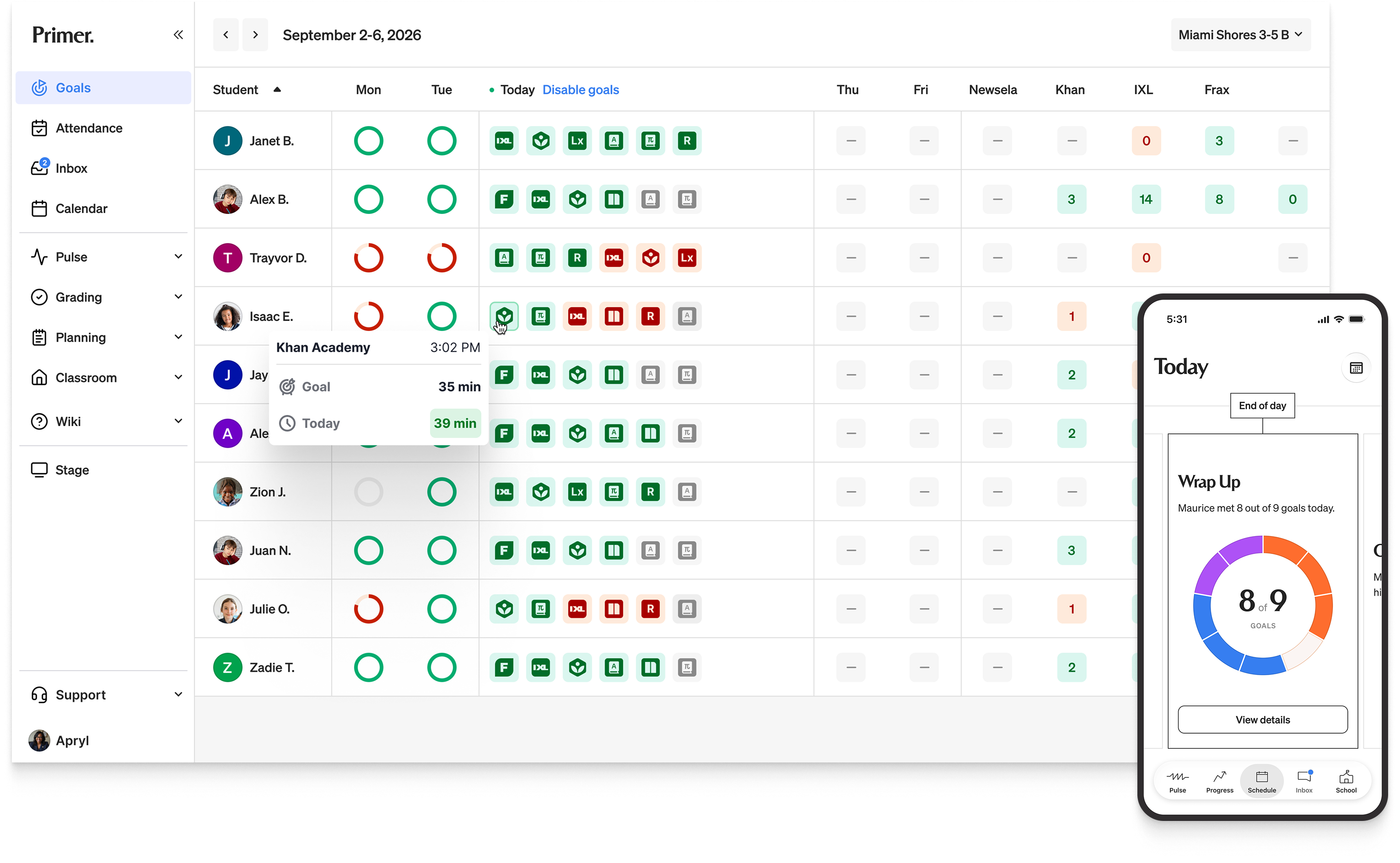
Primer
Connecting parents to the daily rhythm of the school day
Primer runs full-time, in-person K–8 microschools. Teachers and students are in the platform all day because their work lives there. Parents are not. They see the school through whatever reaches them, and that was email, SMS, and a mobile web login they had little reason to use. The challenge was giving parents a real view of their student's day on a surface they would actually open.
Over three years I led UX and Product Design at Primer, where I designed the platform teachers and students use every day. This is the parent side of it. I designed the first native app and iterated on it over a year, shipping to iOS and Android. Every decision came down to the same question: what does a parent want to know, and where does it belong.
Fall 2025
Version 1 app shipped
+50%
Increase in DAUs
85%
App-only engagement
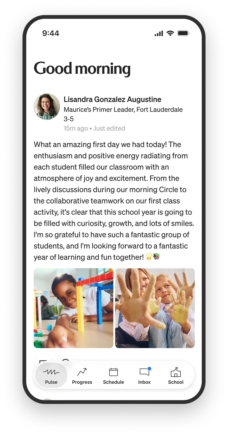
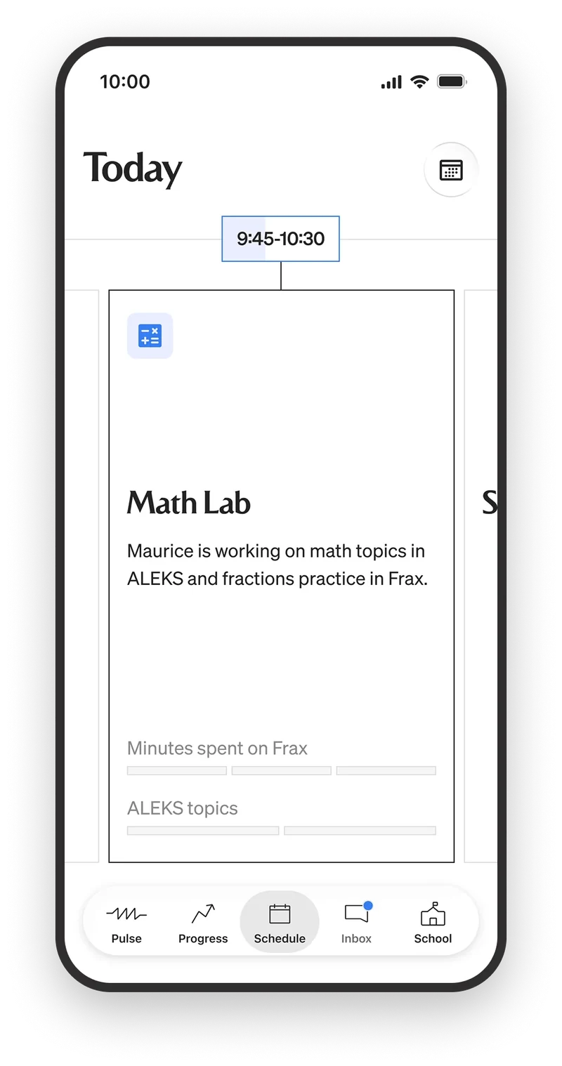
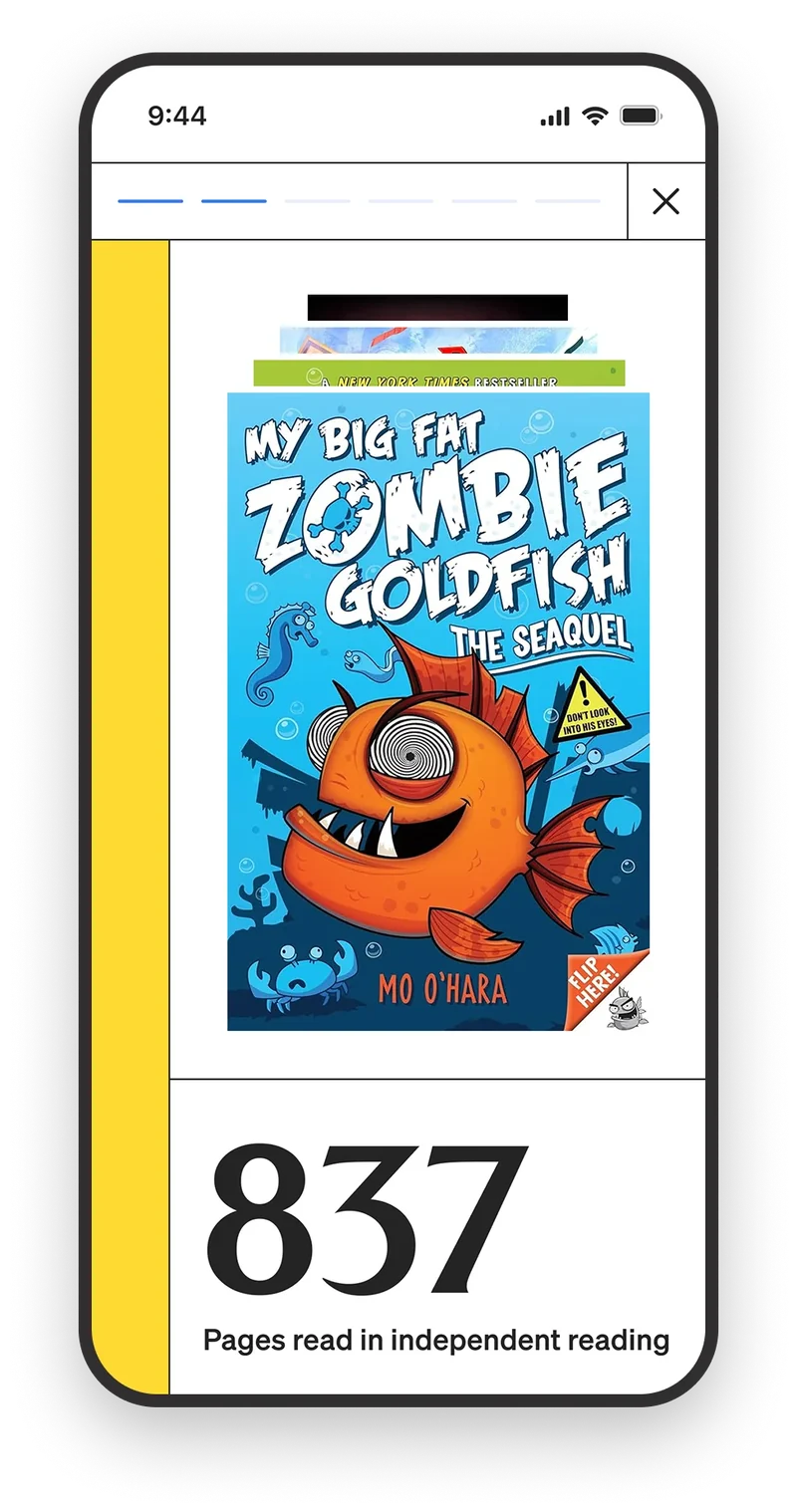
A native app gives parents the information they wanted about their student's day. Updates from teachers, the daily schedule, and a custom end-of-year wrap up, in one place.
Mobile web engagement was limited
Reaching a Pulse post meant finding the email notification it came in. There were no push notifications, a sign-in was forced on nearly every visit, and there was no clear navigation hierarchy, so finding what you needed took extra searching and taps. The native app removes all four and gives parents a single place to check on their student's daily activity.
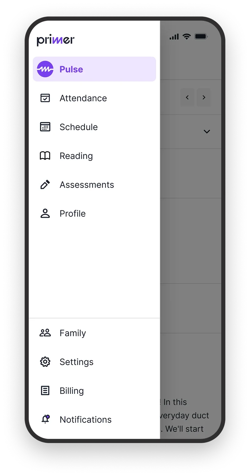
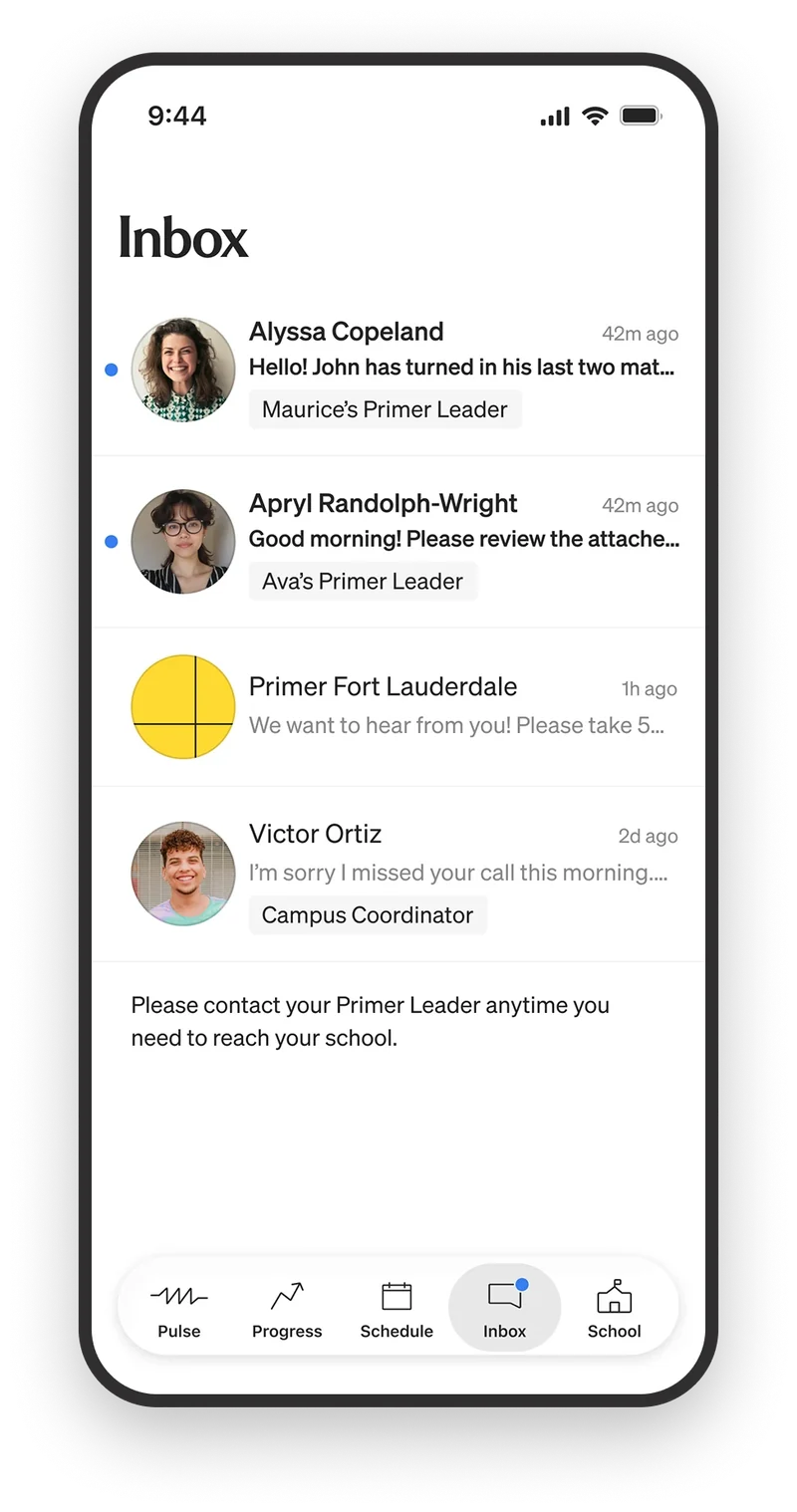
Left, mobile web. Ten destinations behind a menu, after a sign-in. Right, native. Five in the tab bar, including an inbox that did not exist before.
Designing the schedule around what happened today
A daily schedule tells a parent what's happening today: opening circle at 8:15 AM, math at 11:00 AM, recess after lunch. That's helpful but parents wanted to know what was happening in the classroom on a daily basis, not just what time class happens. What did you learn in math today? What are you reading in ELA?
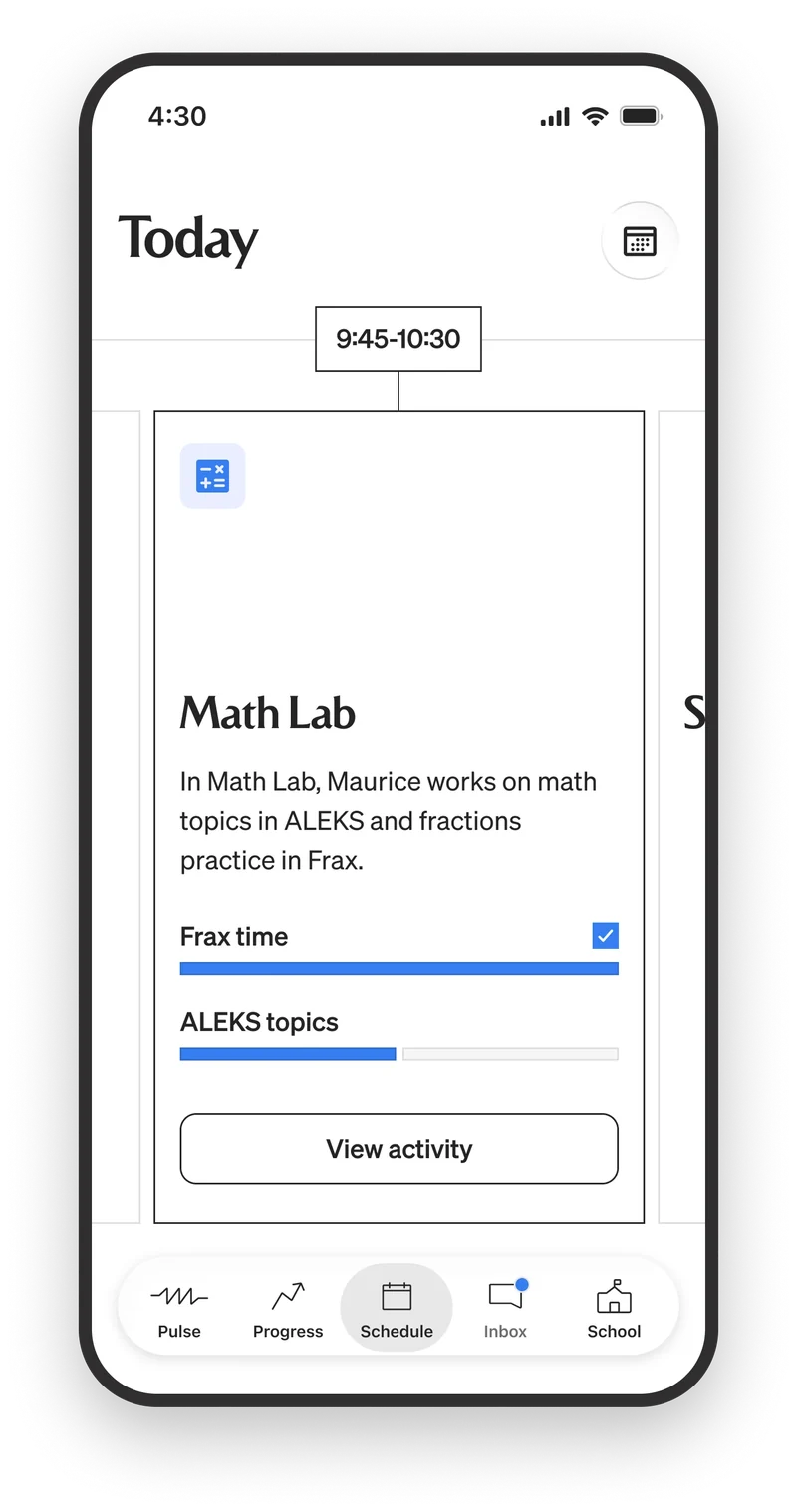
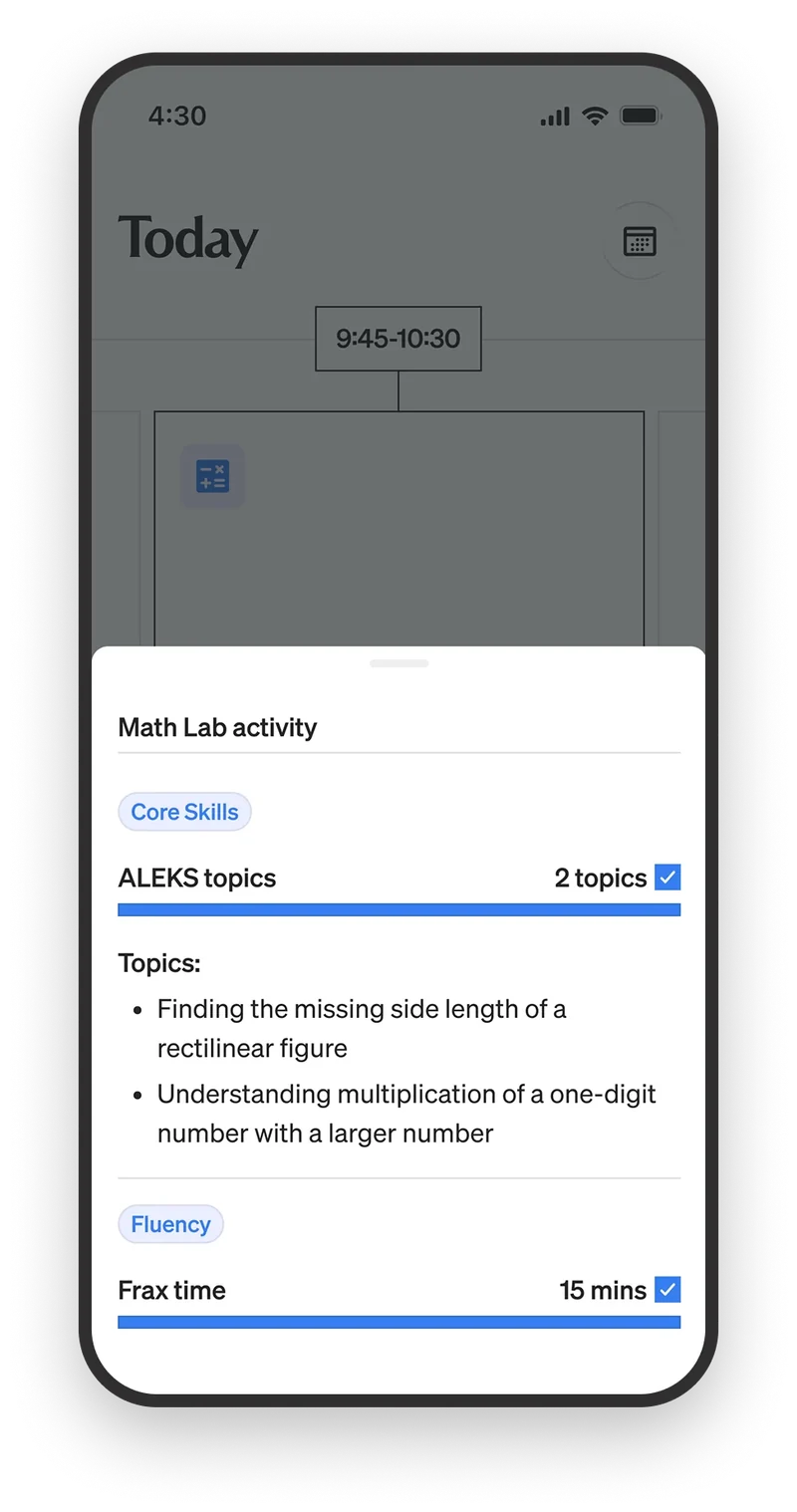
A card per class, with detail one tap away. A parent can open the app any time during the day and see what their student is working on and what they have finished.
The concept was simple. A card per class that advances to the left as the day moves along. The parent can open and see what's happening now, swipe right and see what happened earlier in the day. So, open at 11:00 AM and you see Johnny is in Math class working on multiplication of a one-digit number with larger numbers. Open at 1:00 PM and his Basketball project based learning class just started.
We also designed specific states that parents needed to be aware of: school holidays, field trips, and standardized testing. Every day of the school year is accounted for so parents are always in the know.
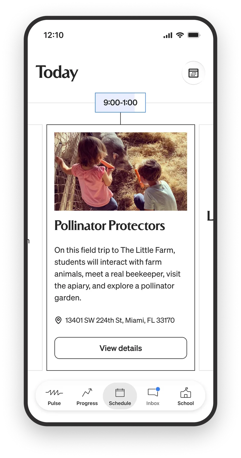
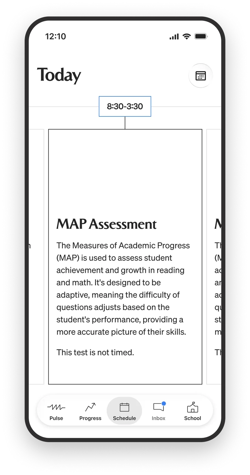
Field trips give parents access to details like a packed lunch or special clothing needs for the day out.
The day closes with a wrap-up of the goals met. Checking daily is challenging so there is also a weekly wrap up with all the work the student did. This type of open communication builds trust with parents about what is actually happening in the classroom.
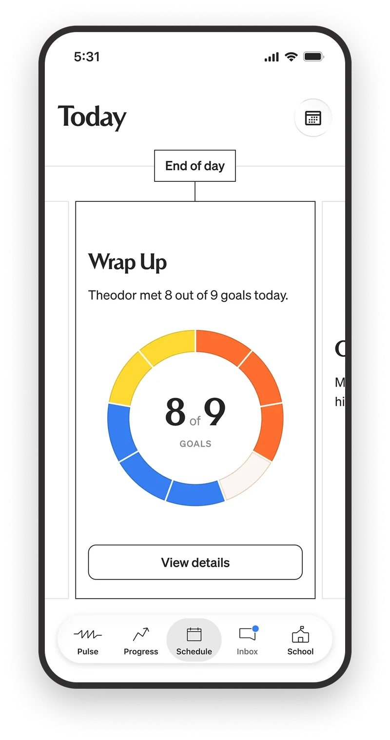
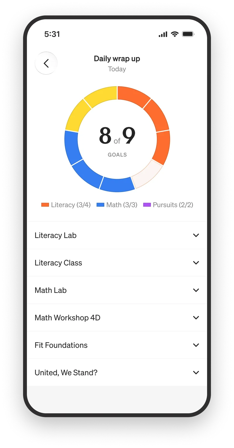
The daily wrap up shows how many goals the student met that day, with detail for each class one tap away.
Two kinds of conversation
Before the app was released, parents communicated with teachers via email. A teacher sent a group email blast when they needed to let everyone know something. And parents wrote 1:1 when they needed to talk to a teacher. This was inefficient and fragmented conversations across an inbox.
The first version of Pulse, web based, replaced the group email blast that teachers had been using. Pulse is a custom feed used by teachers to communicate classroom news with parents. While it was a success, the biggest friction point was not having a real-time, one tap notification.
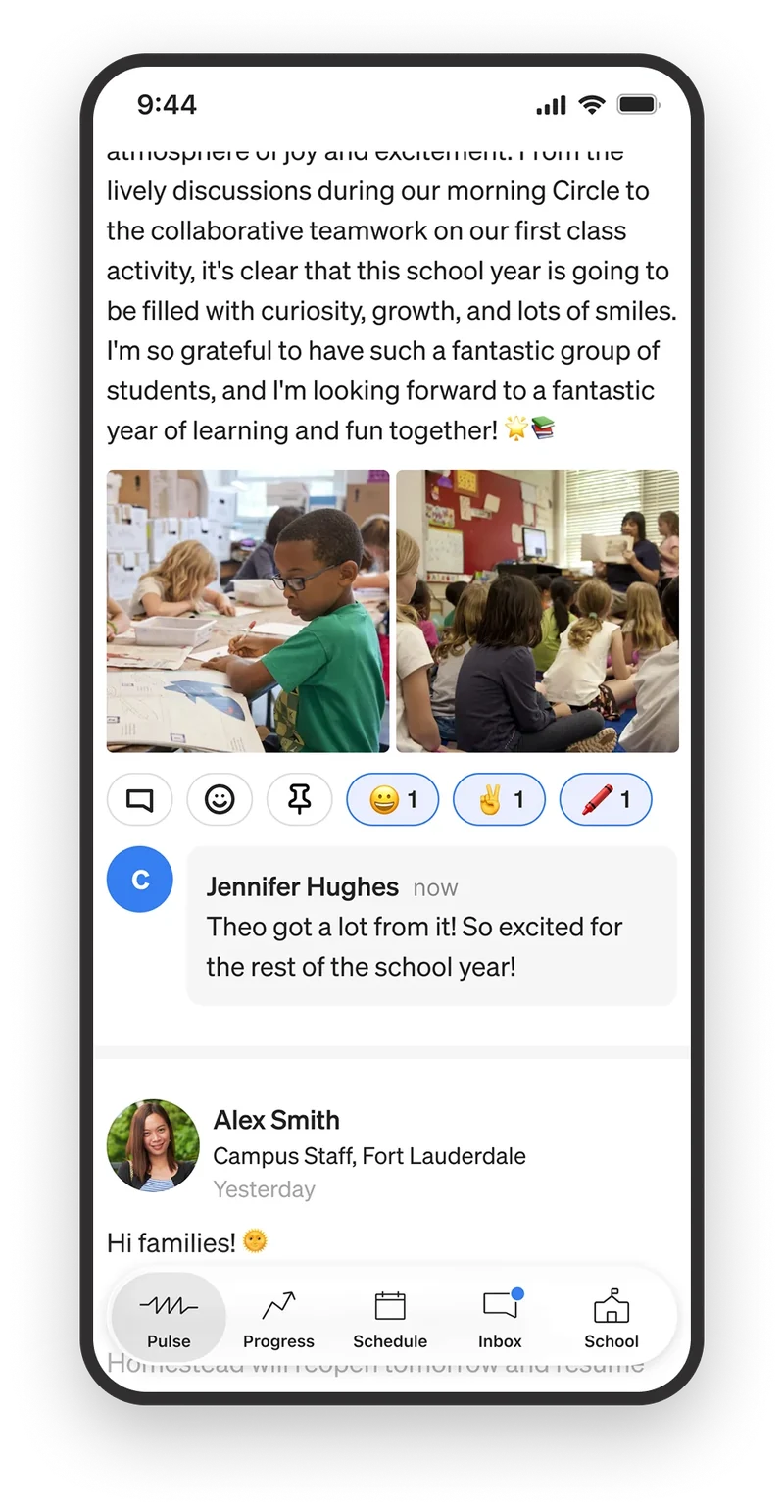
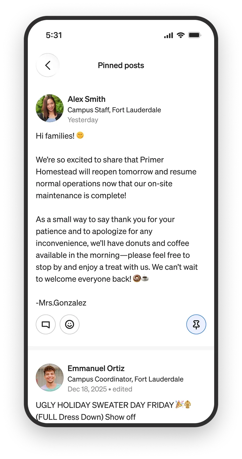
Posts are interactive, from commenting to adding an emoji or deciding to pin one for later.
The native app improved upon the web experience by providing real-time push notifications so parents never missed a post. The app also made it easier to comment, apply emojis, save photos to your personal photos, and pin posts you didn't want to lose in the feed.
In addition to improving the Pulse feed usability problems, a new parent-facing inbox was released with the first version of the app. The inbox allows a teacher to write a parent directly and vice versa. This eliminated the friction associated with email and improved parent-to-teacher communication.
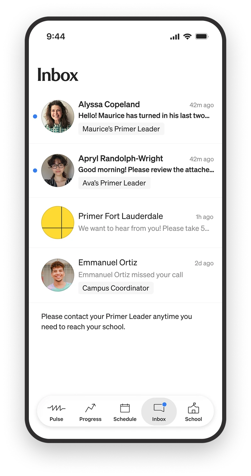
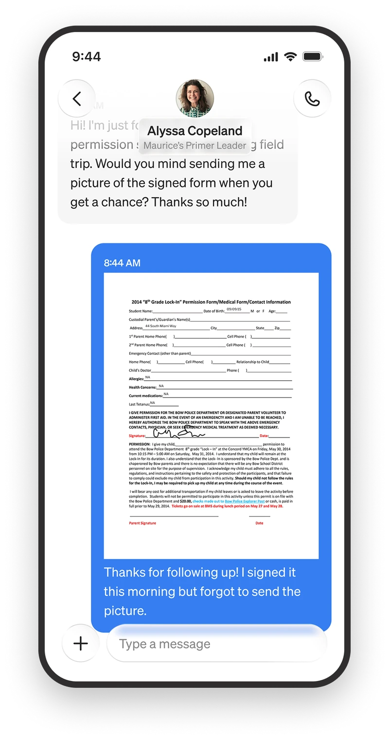
A custom inbox for parent and teacher conversations. Threads keep their context, so a signed permission form lands in the same place the teacher asked for it, instead of somewhere in an email chain.
A cohesive parent experience
Parents used to stitch a picture of the school day together out of email, SMS, and whatever their kid remembered at dinner. Now they open one app and see it. What the teacher posted, what happened in class, what got finished, and what the whole year added up to.
More work